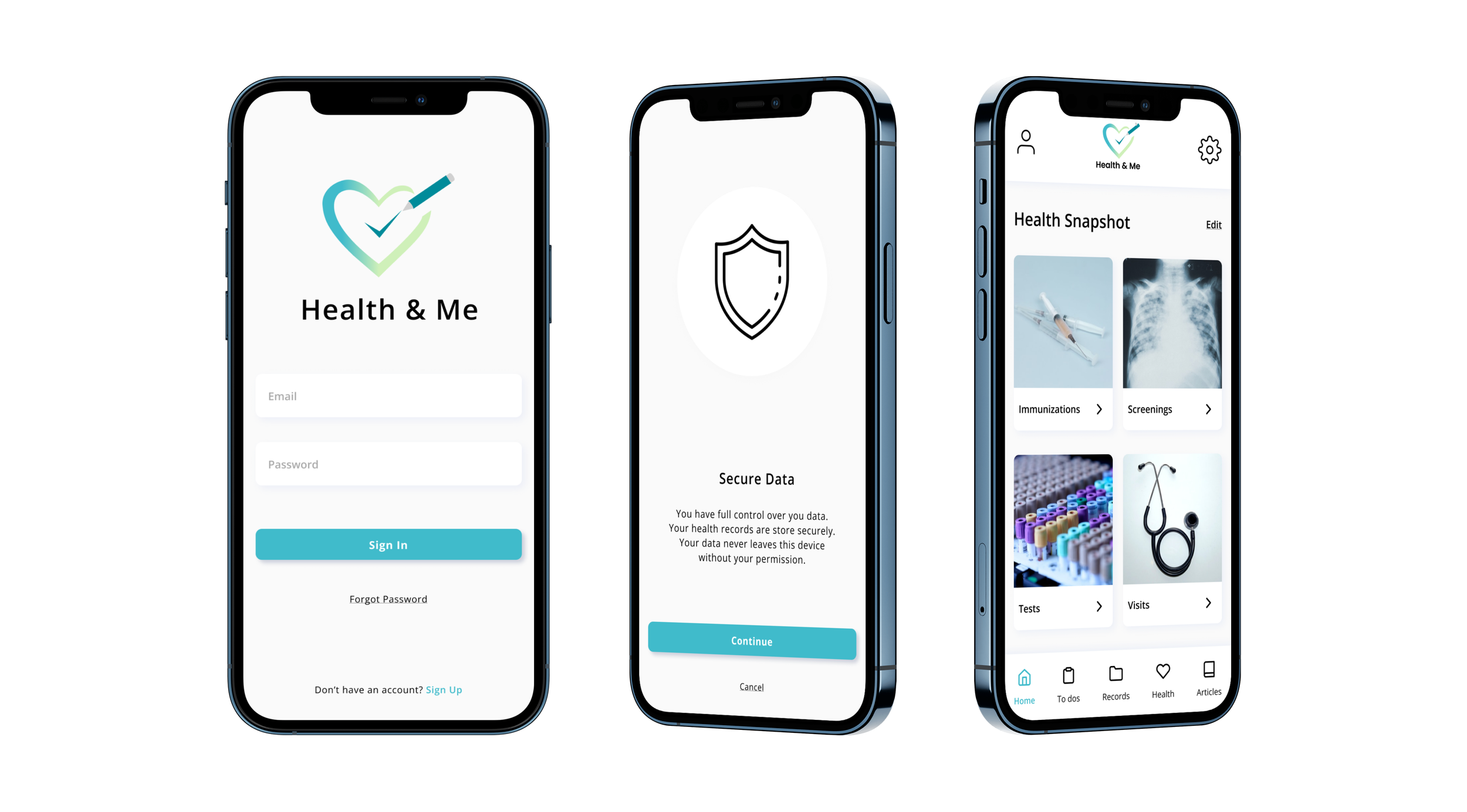
Health & Me
End-to-end Application Tracking Health
Role
Research, UI/UX design, Visual Design
Timeline
1 Month
Tool
Figma, Figjam, Whimsical
The Background
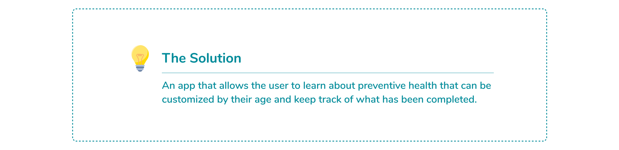
Preventive care is the idea of the individual being proactive in taking the measures for disease preventions and many learn about this through their doctors. Although there are many apps on health and wellness there is a limited market with a focus on preventive care.

DISCOVER
Understanding What Is Currently Out There
Before any design decisions were made, I needed to understand what was currently available in the industry. While I was gathering health and wellness apps to review, I left the CDC website/app out since it was a resource I was planning to use for my immunization portion of the app.
Secondary research was conducted on general health applications and how it had been used by its users to focus on their health. Research was also conducted on the HIPAA compliance that is need for what type of health application
Click to view secondary research
DEFINE
Who Is The Audience
One-on-one interviews were conducted with the mindset that this was going to be an open interview due to the fact that this was a discussion about health. Interviews were conducted to understand how they currently keep track of their health and what their current understanding of preventative health was.
Key findings:
01. Preventive Healthcare
All of the participants think that getting preventive care is important
4/7 find that getting preventive health is not a challenge - most get it in the doctors office
2/7 did not know what preventive care was
“Would feel better going into the doctors office if I had more understanding of my own health and a tracking system because they ask questions.”
02. What will help my health?
3/7 mentioned having a central location to track or get information
3/7 mentioned having a notification button
2/7 mentioned having information for specific age group such as what common issues are
3/7 talked about having some sort of security for health information
“ I think people should worry more about their health and realize that there health data is very valuable.”
03. Overall Health
6/7 think they are are in good shape but know they can do more about their health
6/7 would only go to the doctor only if extremely sick
3/7 currently tracks health either on a app or uses Electronic Medical Record
2/6 regularly see a variety of doctors. average is at least once a month
“Important to have preventive care because then it prevents any major health delays later down the road. And overall, it's just like, it catches things early on when it's, you know, treatable rather than when it gets to the point where it's like now you're just kind of putting a band aid solution rather than resolving a issue.”
How Will The App Be Mapped?
Since this was and end-to-end project, I decided a site map was needed to better understand how the application was going to be mapped out and how screens were going to flow with each other. This site map was then used as a guideline during my sketching to make sure that my pages would flow together.
DEVELOP
What Will the Screens Look Like? - Sketches & Wireframe
Before sketches were started, the competitor analysis were reviewed to see if there were any common functions among the applications. While I was sketching the pages, I made sure that each of my page had consistency with each other to make the design flow.
Solutions to solve for:
How will patients track what is currently due for them
How will patients navigate to their personalized health
How will they find the information they need
Creating the Brand and UI Guidelines
Before working on my brand elements, I grabbed my pen and paper to write down key words that I wanted this app to represent, look and how it would interact with its users. Once I narrowed down my keywords, I created a style tile that would represent those words and incorporated it into my wireframes to make the high-fidelity wireframe.
Creating The First Prototype
Task 1 - 3
Navigate to My Personal Health from the homepage - how would you access it?
Task 4 & 5
Navigate to learn about a specific immunization or test - how is the information display?
Task 6 & 7
Navigate to see what is due and complete - how would you like to review items due or completed?
How Will It Perform? - A Usability Test
The usability tests were conducted over Zoom with permission from my participants. Participants were asked to share their screens so that I could view their interactions with the prototype and to share their thoughts on each screen.
Task 1: Sign up for an account and create a pin
You found this app to learn about preventive healthcare and would like to checkout the app so you decide to create and account.
RESULT: All of the participants were able to sign up for an account pretty easy
RANKING 1 - 5, 5 EASY
75% - 5
25% -4
Task 2 & 3: View Homepage & Navigate to My Preventive Health
You checkout the homepage to see what is available. You decide to explore and what the find the specific preventive health section for you since this is what they app says they provide.
RESULT: Took one participant a minute to figure out the layout and find where they could find this.
RANKING 1 - 5, 5 EASY
50% - 5
25% - 4
25% -3
Task 4 & 5: Learn about Influenza & add to complete
You want to learn more about influenza to see if it’s something you want to complete. You decide you need to get this done so you add this to your to do list.
RESULT: Participants found it confusing for the bookmark to add to the to do section, thought it was to bookmark for an article
RANKING 1 -5, 5 EASY
50% - 4
50% - 3
Task 6 & 7: View and Complete Task
You want to see what you have due so you open up the app. While you are in there you decide to mark influenza as complete because you already completed.
RESULT: All participant were able to mark complete really easily.
RANKING 1 - 5, 5 EASY
100% - 5
After the interviews, I reviewed each individual recordings and wrote down any notes or quotes that I found. I then clustered the notes into groups which lead to my key findings.
Key Findings
What Needs To Be Changed? - Revisions
Revisions were made after reviewing the findings and my notes from my usability testing. Although I had a lot of great feedback and questions about the app, I had to narrow it down to a few revisions that would help move the app forward.
DELIVERY
User Tested Prototype
Revisiting the Project - Updating the UI
While viewing my projects, I felt that this project could benefit from having an updated UI. To start the process, I decided to view my original style tile and create a new style tile that would better reflect a refresh on the app.
Rebranded High Fidelity Wireframe
Using the style tile as a guide, I changed the high fidelity wireframes. The use of shadows were utilized in place of the lines to make the design more clear. The icons and photos used felt more fit to the modern look than the use of solid icons.
New Brand Prototype
Lessons Learned
This project was started with the understanding that although there is a large health and wellness apps available, there was limited amount of apps for tracking preventive health. Since this application was going to ask for the user’s personal, medical and health information, I also had to do research in regards to how this application was going to be HIPAA compliance or if it needed to be so.
During this process, one of the challenges I had was trying to create the pages and icons to adequately show how the information was going to be displayed. Since this was an end-to-end project it would have been easy for me to keep created the pages I would like or needed for this app. There were a couple of times where I had to realign myself with my goal for this project to focus on what was needed. The refocusing helped me stay on task and move forward.
Next Steps
I would continue with the usability test to see if there were any additional misunderstand or if there were areas that needed more clarification. Then for the next revisions I would build the other pages for a more robust prototype and continue testing.
View Other Projects
Mirror Case Study
UX Research - UX Design - End-to-end Responsive Webdesign

Duolingo Feature Case Study
Mobile - EdTech App Feature - UX Research - UX Design
**Disclaimer - This is a project & not affiliated with Duolingo