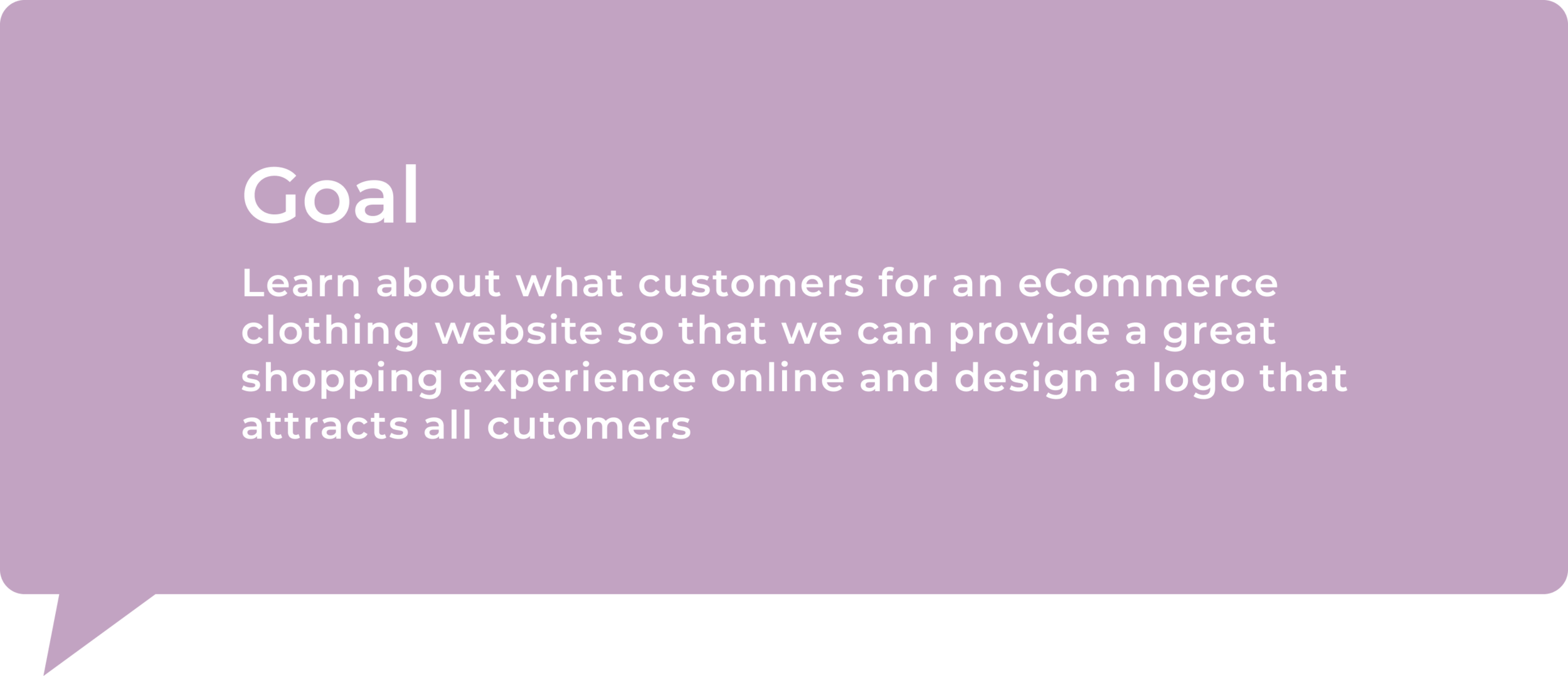
Expanding the shopper’s experience - Mirror
End-to-end Responsive Web Design

Role
Research, UX/UI design, Visual Design
Timeline
1 Month
Tool
Figma, Figjam, Optimal Workshop, Whimsical
Background
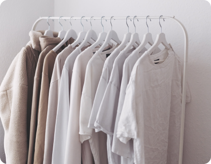
Mirror is a clothing store, started in 1994, that focused towards budget-minded customers who were looking for affordable clothing, Mirror has a large customer base at their stores with more than 400 stores around the world, in 32 countries. Although their brick and mortar stores are well received, customers for many years have asked for a website.
EMPHASIZE
Let’s Explore What’s Out There - Conducting Research
Mirror is new to the ecommerce retail world. In order to understand the current market and how each market create a enjoyable user experience, I used a variety of methodologies to conduct this research - such as competitive analysis and market research.
These were my key findings after my competitor analysis and market research.
DEFINE
Learning About My Audience and What Their Needs Were
I conducted five one-on-one interviews with participants between the ages of 21 - 29, male and female. These participants need to be those who have shopped in-person or online in the last three months. These 1:1 interviews were conducted virtually over Zoom with the participants’ consent to record the sessions.
A few questions that were asked:
How often would you say you shop for clothes?
Why do you go shopping? (Specific event, for fun, or to pass time)
When was the last time you shopped online? Can you walk me through your experience?
After reviewing each interviews, I started to organize my notes into categories and found my participants goals and frustrations.
Who Are The Shoppers? - Persona
Through my research and interviews I found that users wanted a simple layout with the following:
easy to navigate site
reliable sizing chart
reviews from customers
good quality at a reasonable price.
Based on the findings, my persona, Eloise Han, was created. Eloise enjoy wearing versatile clothing that are at a reasonable price since she is conscious of her budget. Since she is in the beginning of her career, the convenience of online shopping allows her to have more personal time.
This persona was created to help keep in mind who a potential audience was as we went through the design process.
How Do They Navigate?
In order to gain further insight on a user’s behavior, I conducted an open card sort through Optimal Workshop. The goal of this exercise was to observe the patterns of each participant and how they would categories the items given. There were a total of seven participants and each were given a set of 20 cards to sort.
Through this activity I was able to see how items were being categorized which guided me as I created the site map for the website.
DEVELOP
How Is This Website Going To Work? - User Flow
The user flow was created to map out how Eloise, my persona, would navigate through the website. The task that this user flow showed was the purchase of a specific clothing item.
View User Flow
How am I designing this website? - Wireframes
Low-fidelity wireframes were created based on the user flow. The user flow was used as a guide for the pages I would create in order to complete the task of purchasing an item on the website.
Homepage - search item ➜ Category page - view available items ➜ Product page - View selected item ➜ Checkout - complete purchase on site.
What Would It Potentially Look Like On Different Devices?
Responsive wireframes were created for the Homepage to show how each page would be view on a desktop, tablet and mobile.
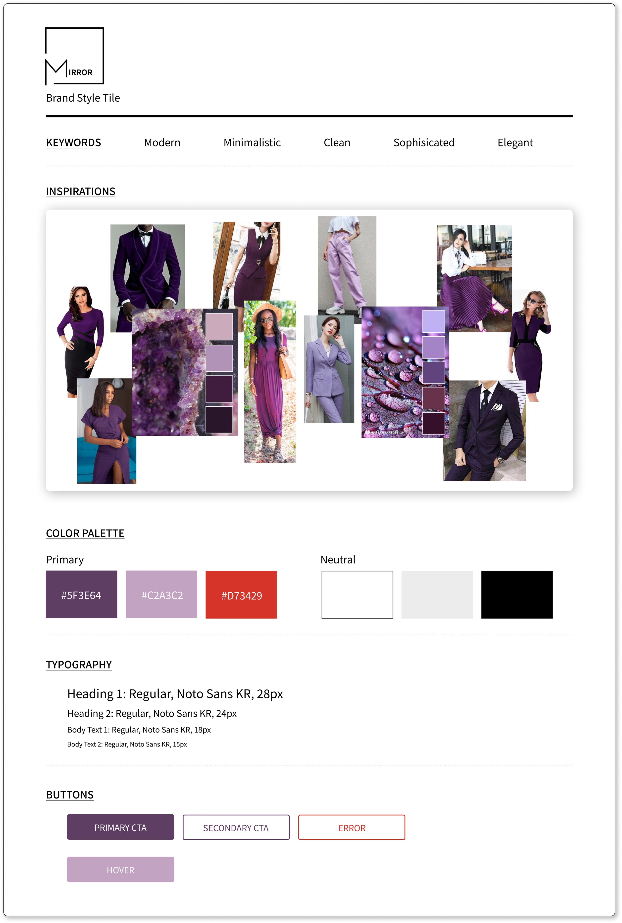
How Is This Going To Look? - Style Tile
I created a style tile that would match the new look that Mirror was going for. The keywords I focused on were elegant, modern, minimalistic, clean, and sophisticated. For the new Mirror logo, it was inspired by the style tile and keywords.
Putting The Pieces Together - High Fidelity Wireframe
Elements from the style tile were placed into the desktop low-fidelity wireframe which created the high fidelity wireframe.
Is This Working? - A Usability Test
To test the usability of the website, I created a high-fidelity prototype. The goals of this usability test were to:
Test how users are interacting with the site by completing the task of finding an item, adding to the cart and making a checkout.
Observe if there are any pain points about the website as the user completing task
Test if the flow of the design makes sense as the participant is view the site
I had a total of 6 participants that accepted in being part of the usability testing for the Mirror website. The usability test was conducted through Zoom and in person when it was allowed. The participants ranged between the ages of 21-28, male and female. For the test, each participant was given a task to complete on the website.
An affinity map was created after the usability testing. Overall all of the participants were able to understand the task given and were able to navigate through the site.
Reviewing my affinity map, I was able to create a like and recommended column within each category. With those column I was able to find the most common likes and recommendations among my users.
Let’s Make Some Changes - Revisions
I reviewed the recommendations from my usability test and decided to implement those revisions to my next prototype since it would increase the user’s experience with the website.
Changes Are Done, How Does It Look Now? - Final Prototype
“Clean & Straightforward, very simple but thorough, finding things is really easy.”
Lessons Learned
Since this was my first project, I learn quickly that there was a lot that I needed to learn. Throughout the project, I was able to better understand the functions of Figma and learn what my limitations were with the application. Knowing I had limitations with Figma, I decided to spend some time to learn new functions that would help me to continue to grow in this application.
One of the biggest lesson I learned while doing this project was that hierarchy was very important in the design of a website. The use of hierarchy for the text was very important on the product page. In addition to learning how to use hierarchy, I also learned how to make use of the white space to enhance my hierarchy on my text.
Next Steps
For next steps, I would conduct another usability test with my final prototype and make revisions based on that test. In addition to the revisions, I would also add additional pages to make the prototype more robust to allow the user to have more interact with the prototype to better understanding how they would use the website.
View Other Projects
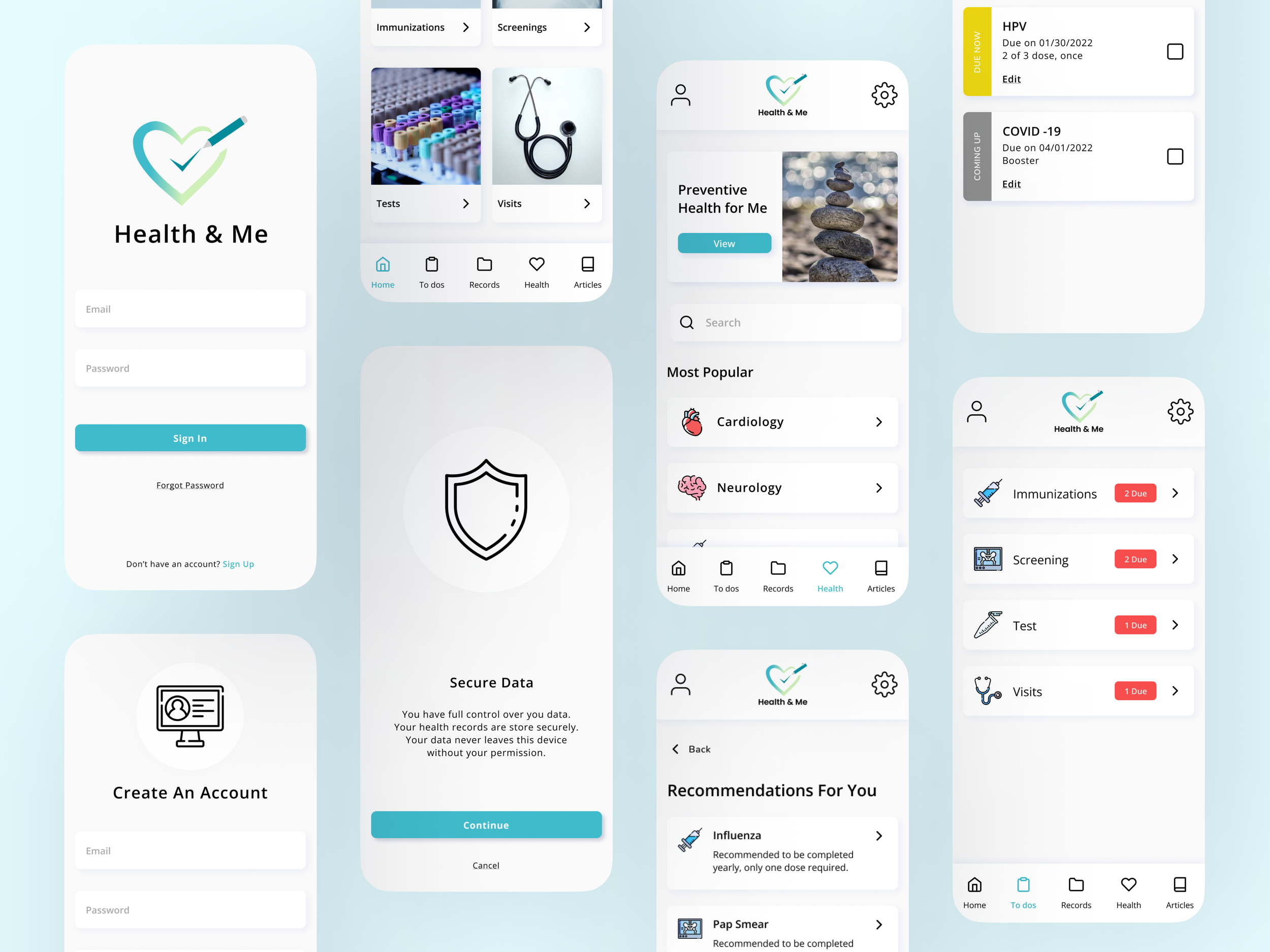
Health & Me Case Study
Mobile - End-to-end App - Product Design - Branding
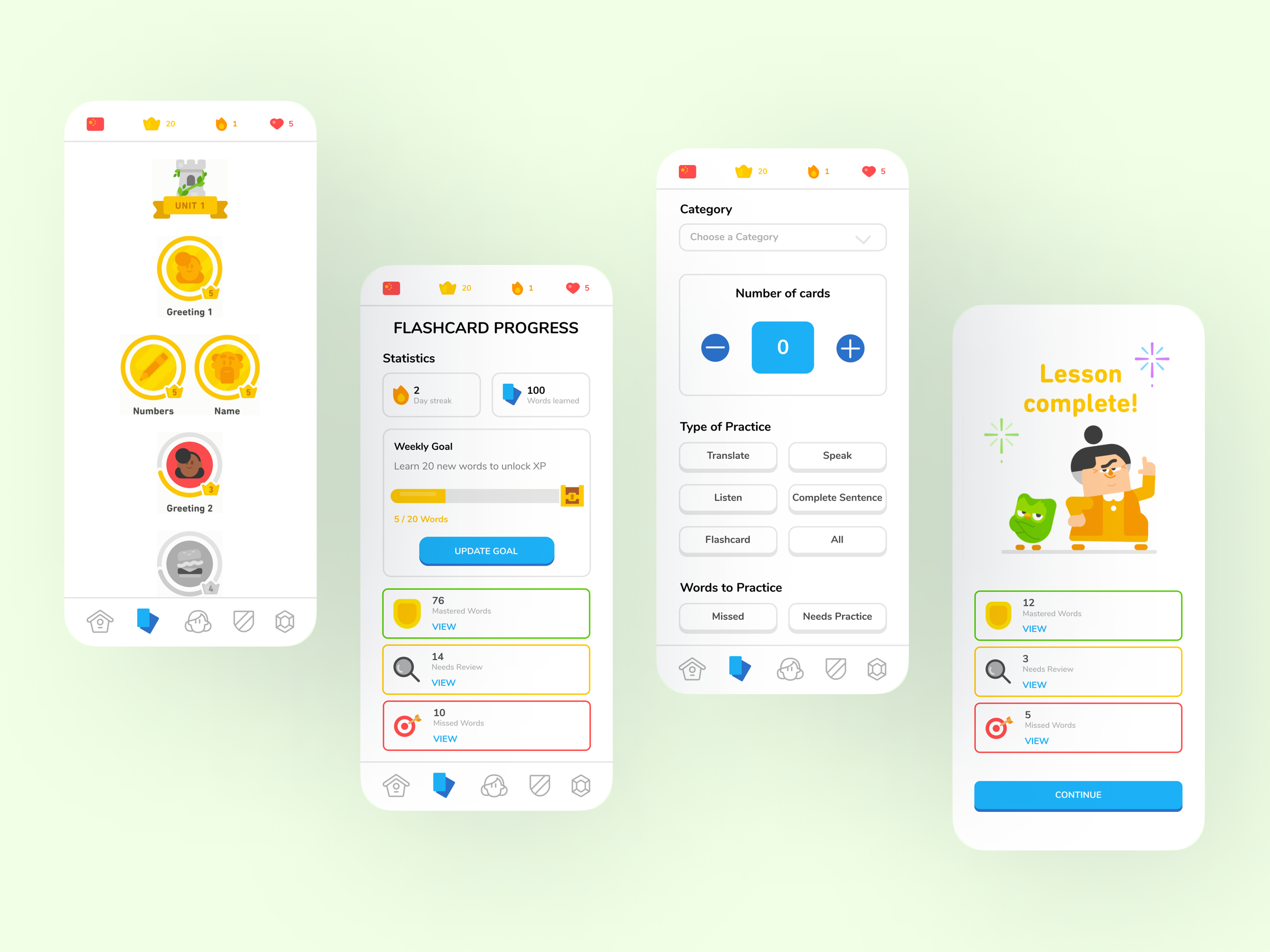
Duolingo Feature Case Study
Mobile - EdTech App Feature - UX Research - UX Design
**Disclaimer - This is a project & not affiliated with Duolingo